
Understanding our Trading Tools
Our 4XVision trading tools have (for the most part) the same UI (user interface) to keep the learning curve as easy as possible.
Our goal is to teach you how to and not spend a ton of time learning how to use our tools. We designed our tools to be as user-friendly as possible.
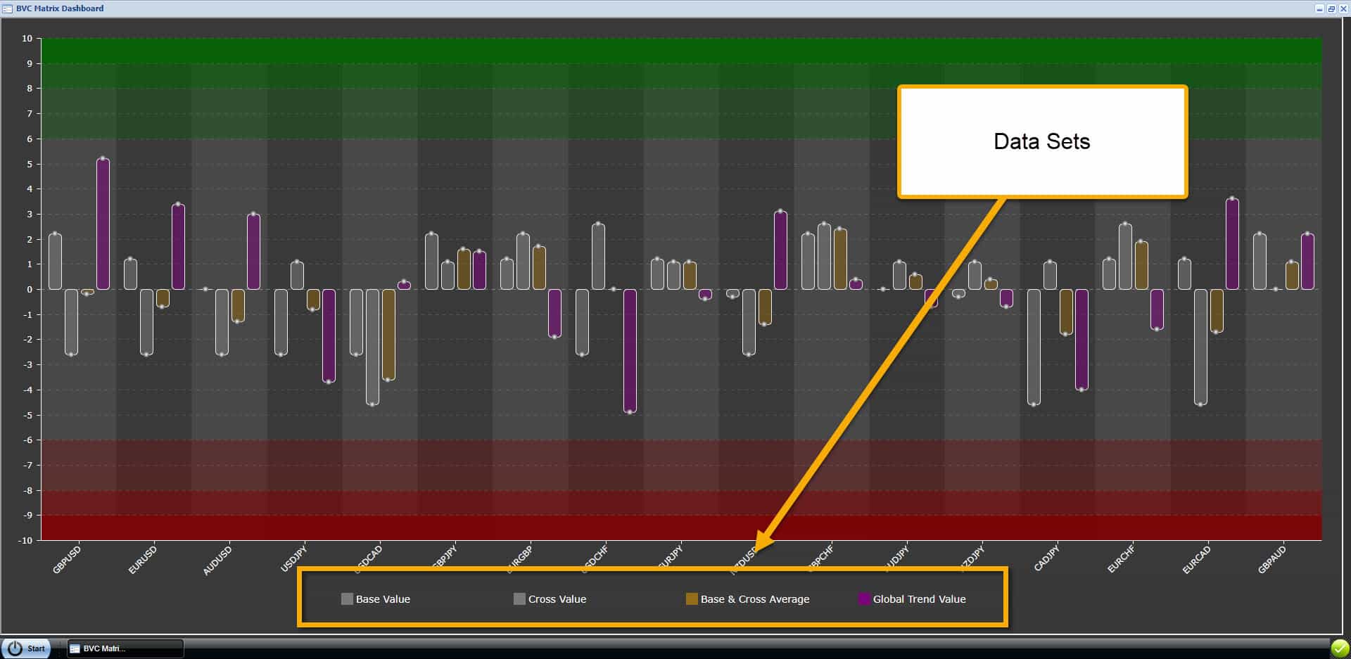
Data Sets at the Bottom
All of our tools have “clickable” data sets at the bottom. You can click on the labels or colored box to turn each data set on/off.
You can customize each tool to show all or only a few data sets.
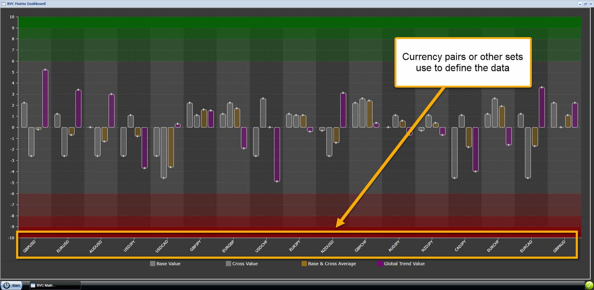
Currency Pair or Other
Just above the data sets, on the X-axis, are the currency pairs or other class sets. The data sets are applied to these values.
Most of our trading tools have currency pairs on the X-axis, but a few of our tools have other values.
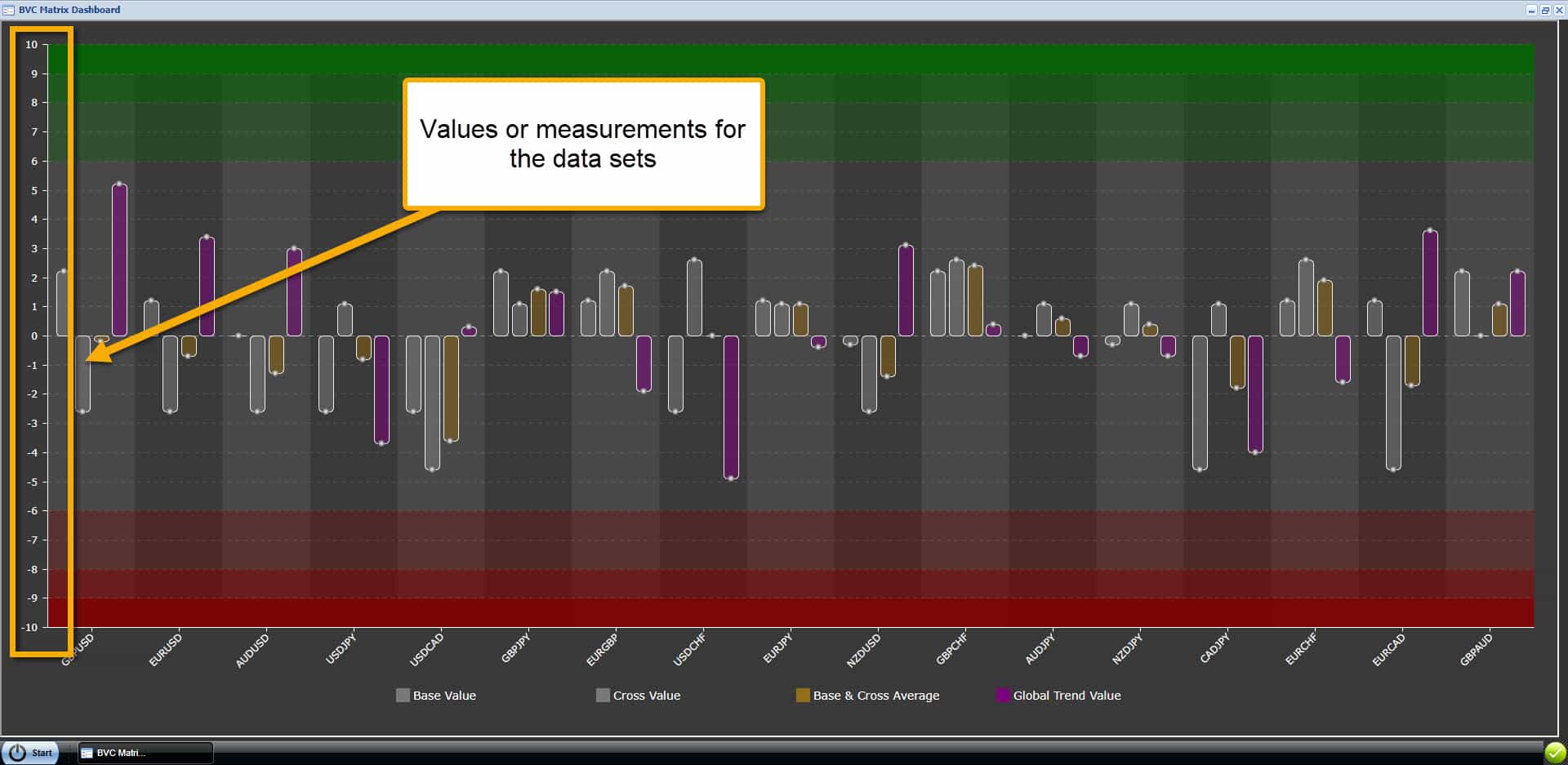
Data Set Values
The left side or Y-axis displays the range for the data sets. There are horizontal grid lines on our tools to help you easily reference the range values.
You can also hover over each data set graph line in the chart window and a tool-tip will open to display the exact value.
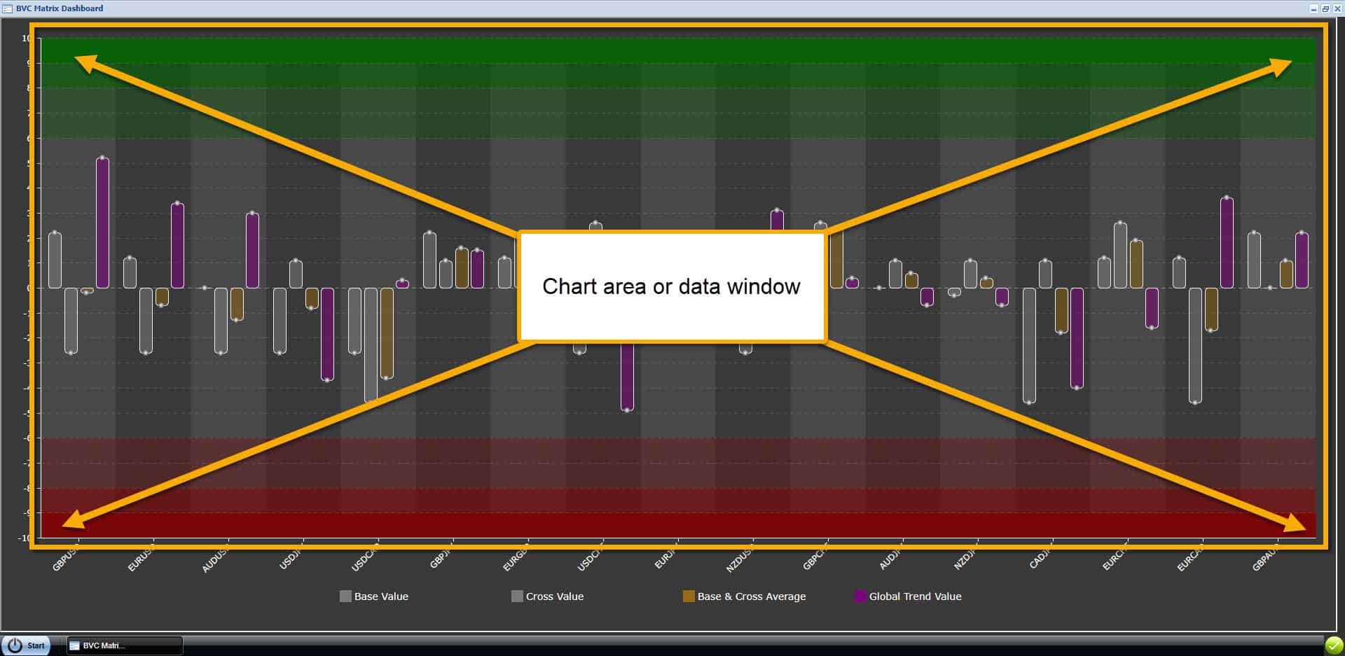
Chart or Data Window
All of our trading tools have a chart or data window to display the graphs and lines. You can resize the trading tool window by grabbing an edge and dragging.
Color areas at the top and bottom of the range are used to indicate over-bought or over-sold conditions.
Green = Over-Bought and needs to consolidate
RED = Over-Sold and needs to consolidate
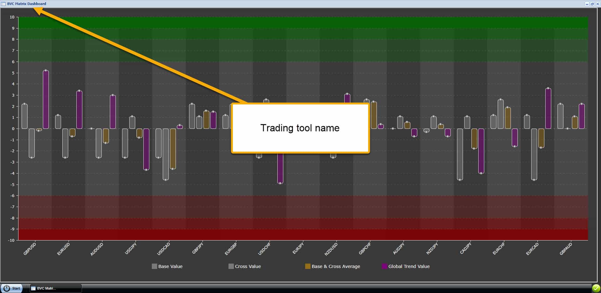
Trading Tool Name
All of our trading tools display their name in the upper left corner should you need to reference that information.
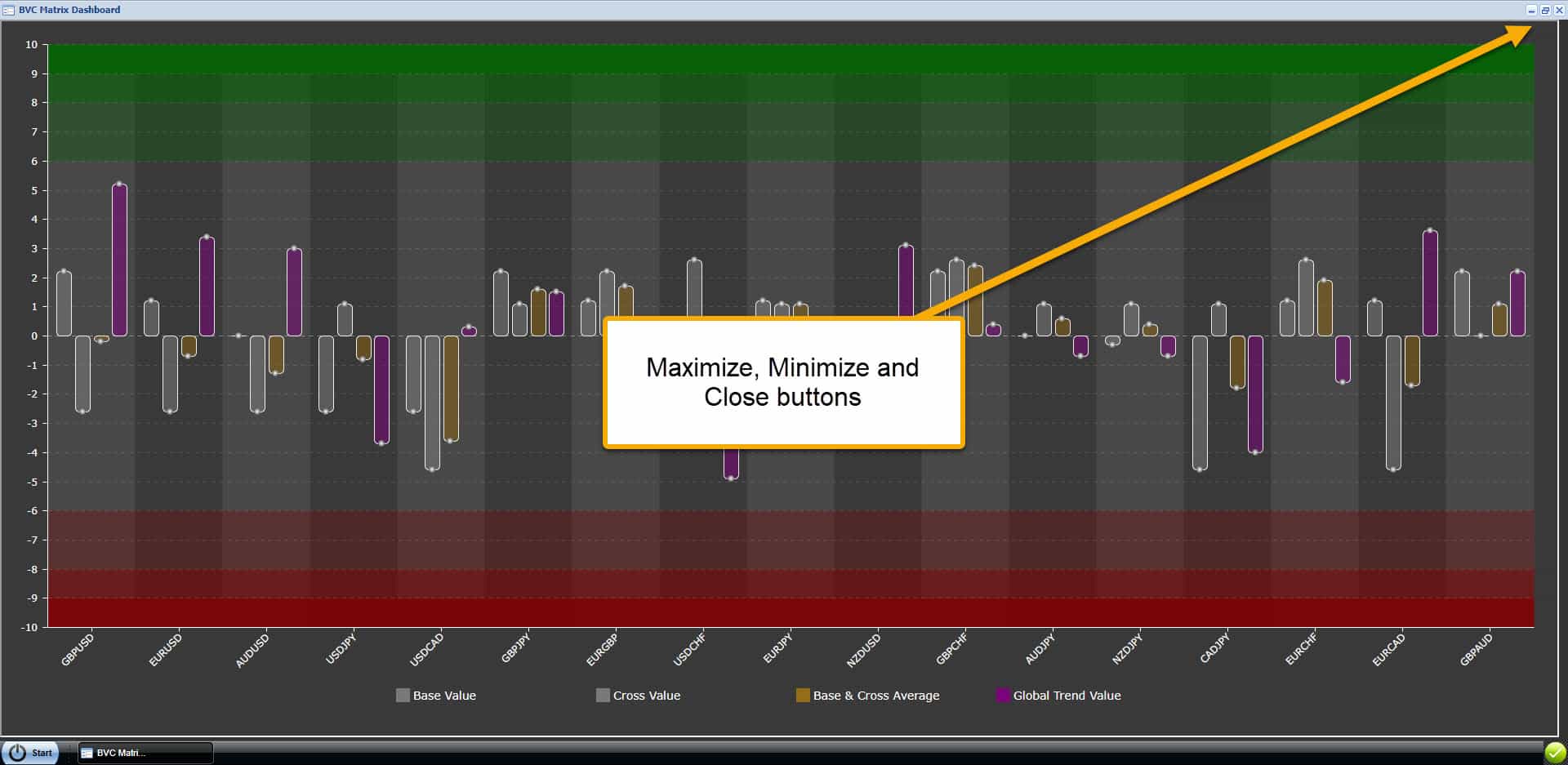
Window Control Buttons
All of our trading tools have 3 buttons in the top right corner (from left to right): minimize, maximize and close.
That’s it! You are finished with this section. You can expect similar features on all of our trading tools!